Visualize in Quicksight
Visualize in Quicksight
In this module, we will use Amazon Quicksight to build some visual charts based on data that has been collected and stored on S3.
Feel free to explore the different visualization options available in Quicksight!
QuickSight Setup
- In this step, we will visualize the processed data using QuickSight.
- Access: QuickSight Dashboard
- Select Sign up for QuickSight
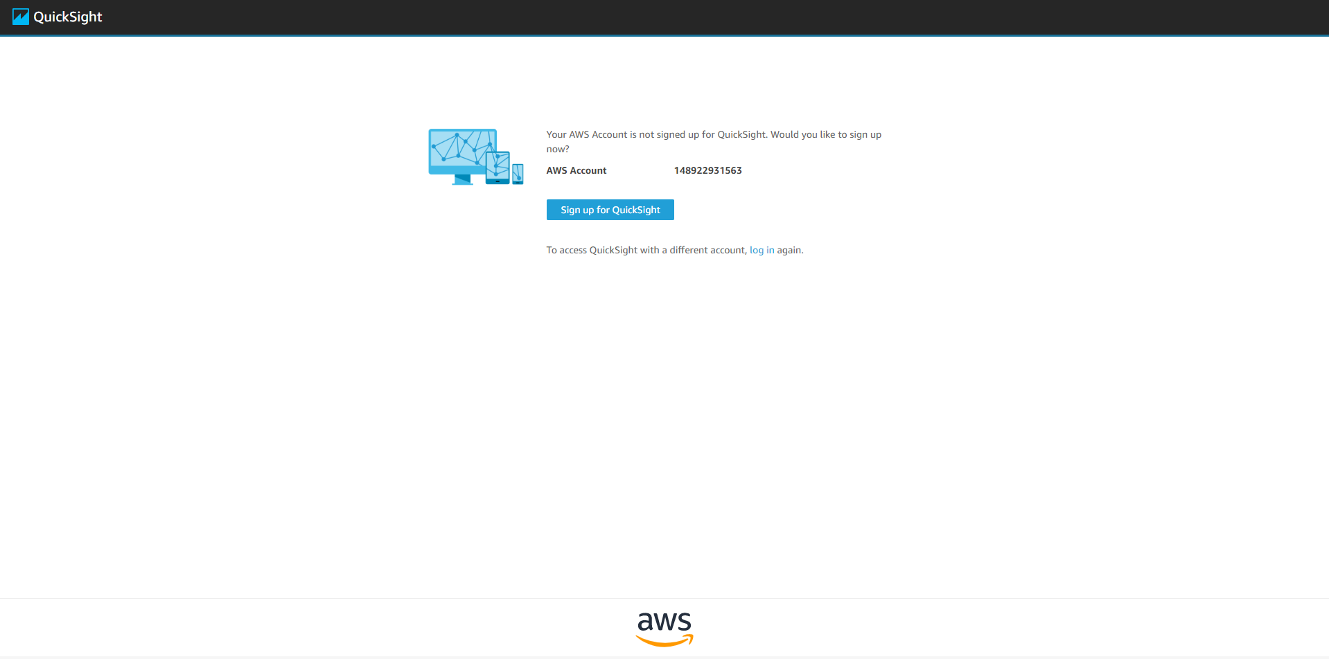
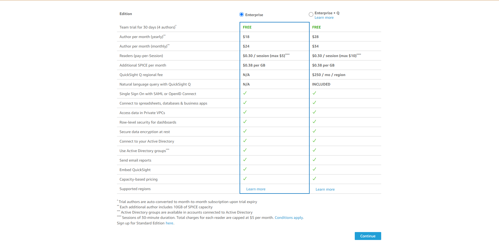
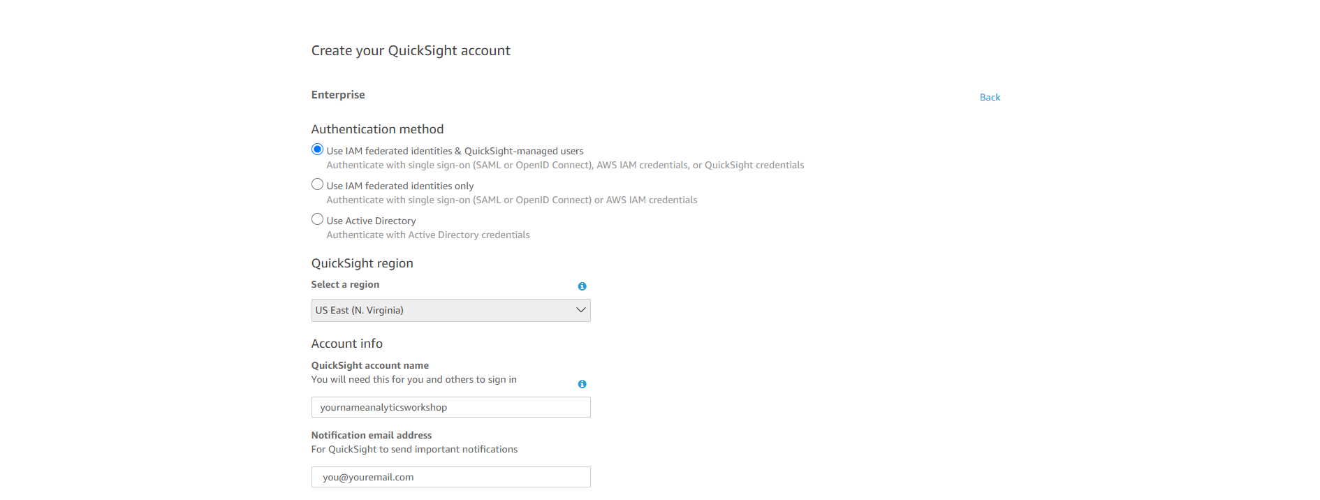
- Make sure Enterprise is selected and Click Continue
- QuickSight account name: yournameanalyticsworkshop
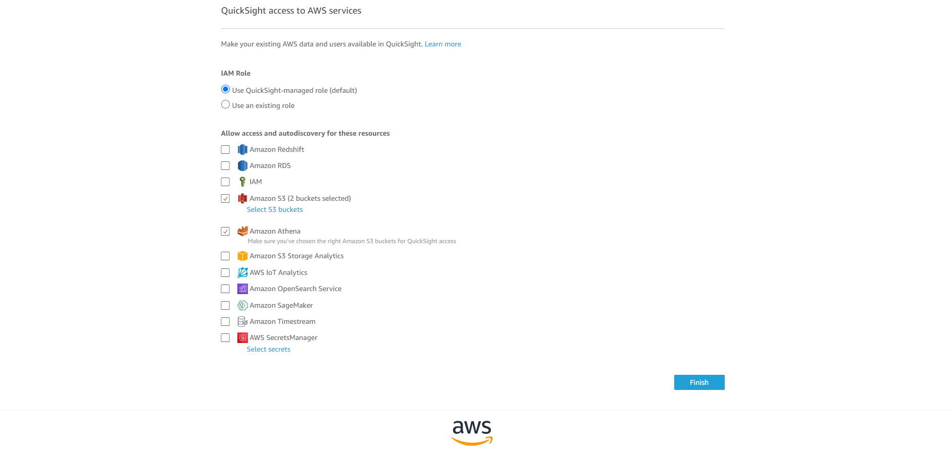
- Notification email address: you@youremail.com Select Amazon Athena - this allows QuickSight to access the Amazon Athena database
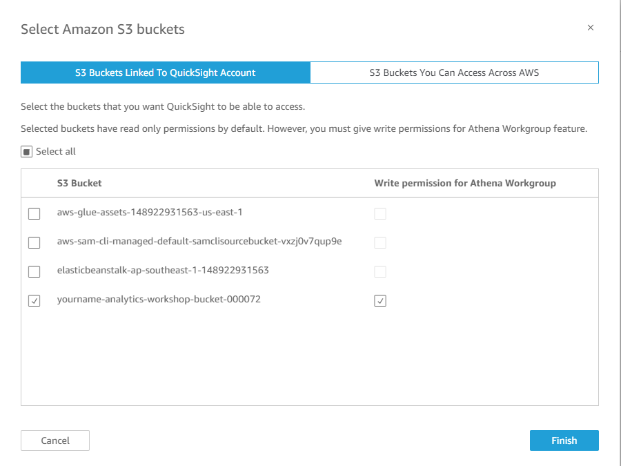
- Choose Amazon S3 Select yourname-analytics-workshop-bucket Select Finish
- Select Finish Wait for your QuickSight account to be created

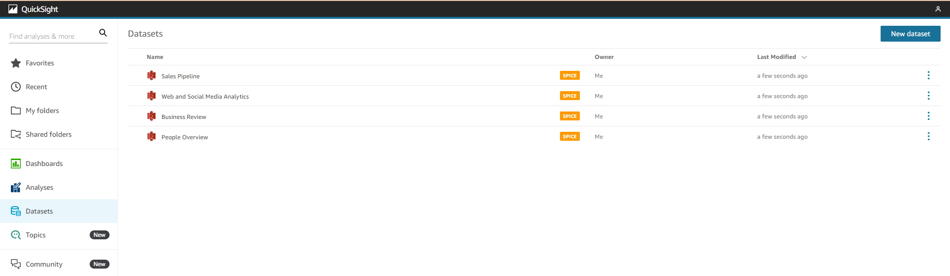
- Add a New Dataset
- Access:
- In the upper right, Select New Dataset
- Select Athena
- New Athena data source
- Data source name: analyticsworkshop
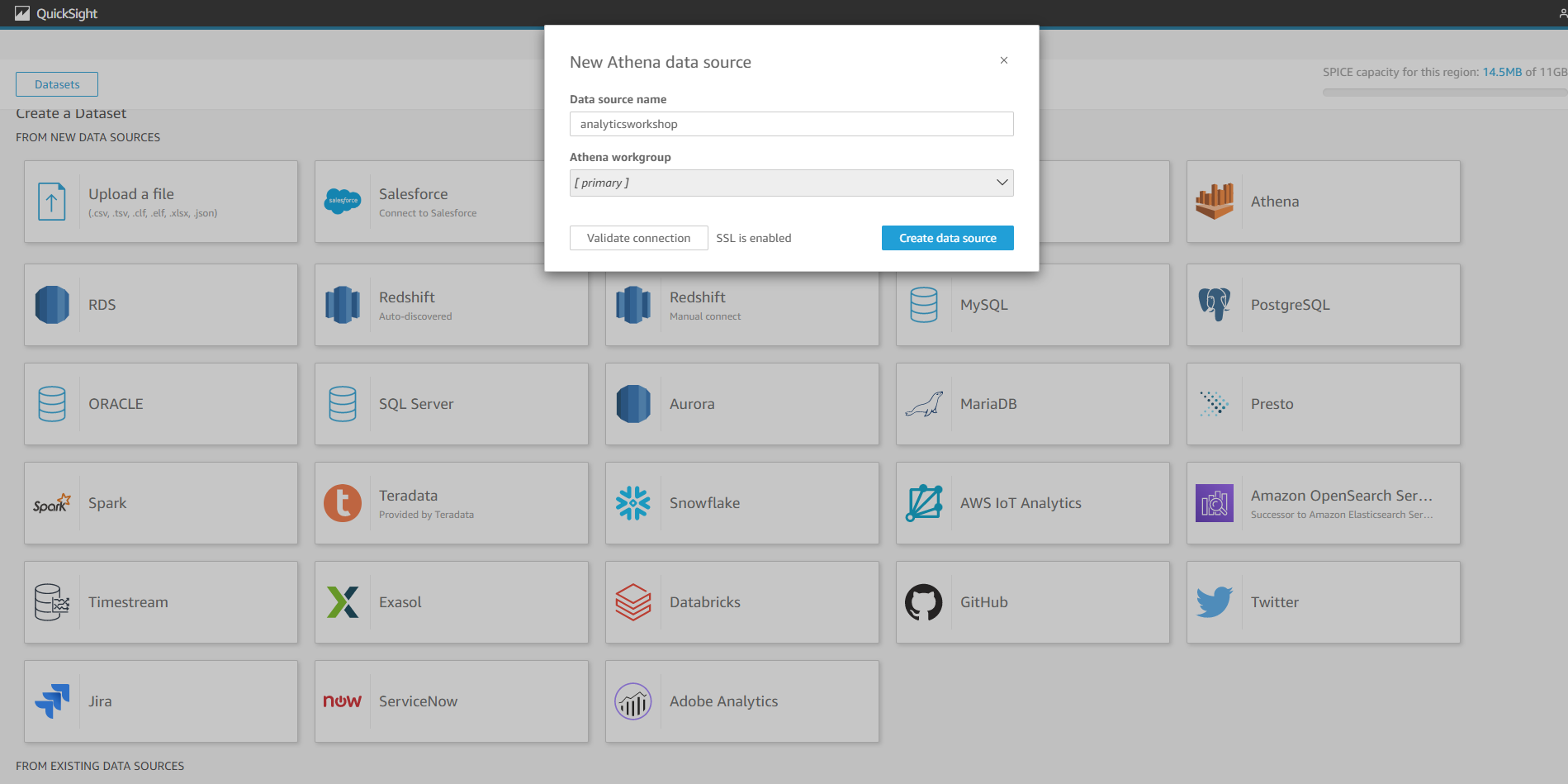
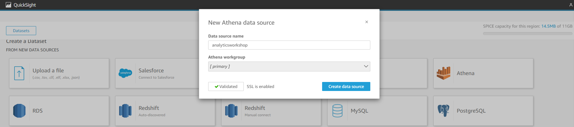
- Select Validate connection
- This will check if your QuickSight can access Athena
- Select Create data source
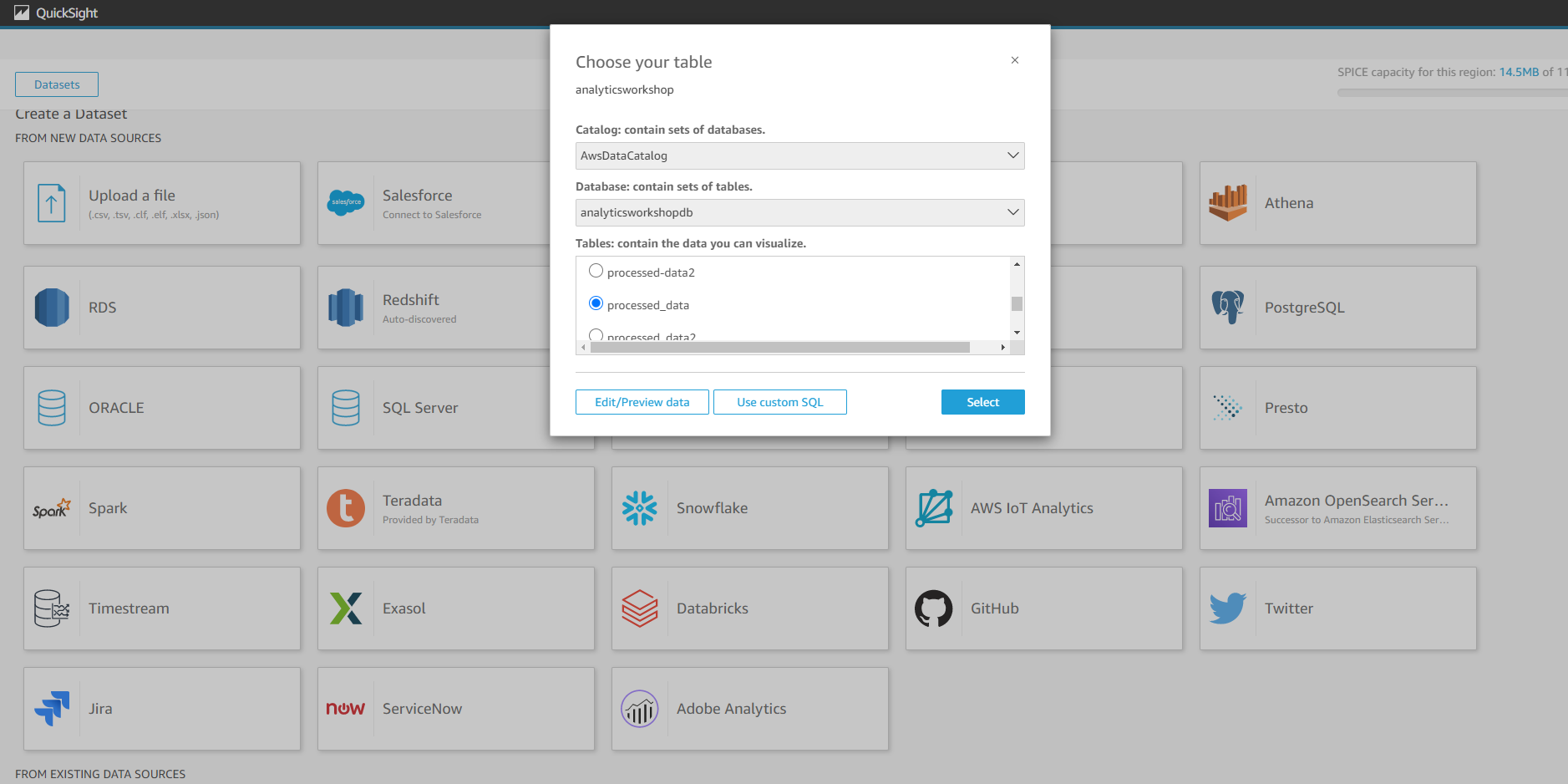
- Choose your board:
- Database: contains sets of tables - choose analyticsworkshopdb
- Tables: contains data you can visualize - choose processed_data
- Select on Select
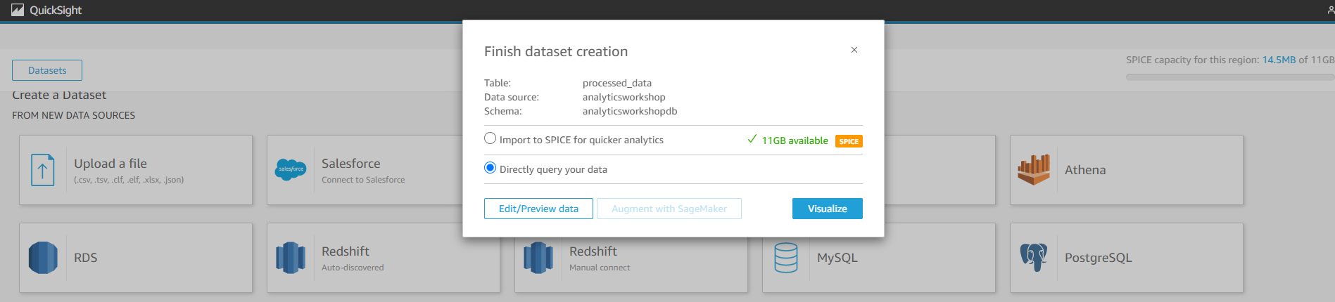
- Complete data set creation:
- Select Directly query your data
- Select Visualize
- Use Amazon Quick Sight to Visualize Our Processed Data Visualization 1: User’s heat map and the songs they’re listening to
- In this step, we will create a visualization to see which users are listening to songs over and over again.
- On the bottom left panel ((Visual types):
- Hover over icons to see the names of available visualizations
- Select on Heat Map
- On the upper left panel (Fields list)
- Select device_id
- Select track_name
- Right above the visualization you will see Field wells: Rows: device_id | Columns: track_name
- If you hover over the dark blue areas on the heatmap, you’ll see that those particular users are listening to the same song over and over again.
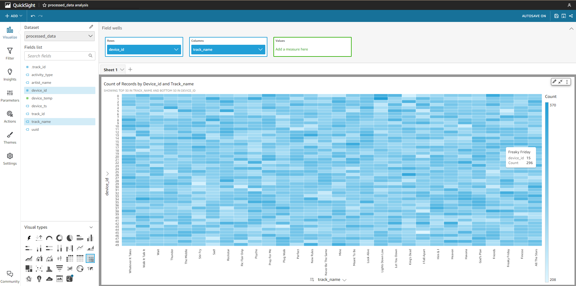
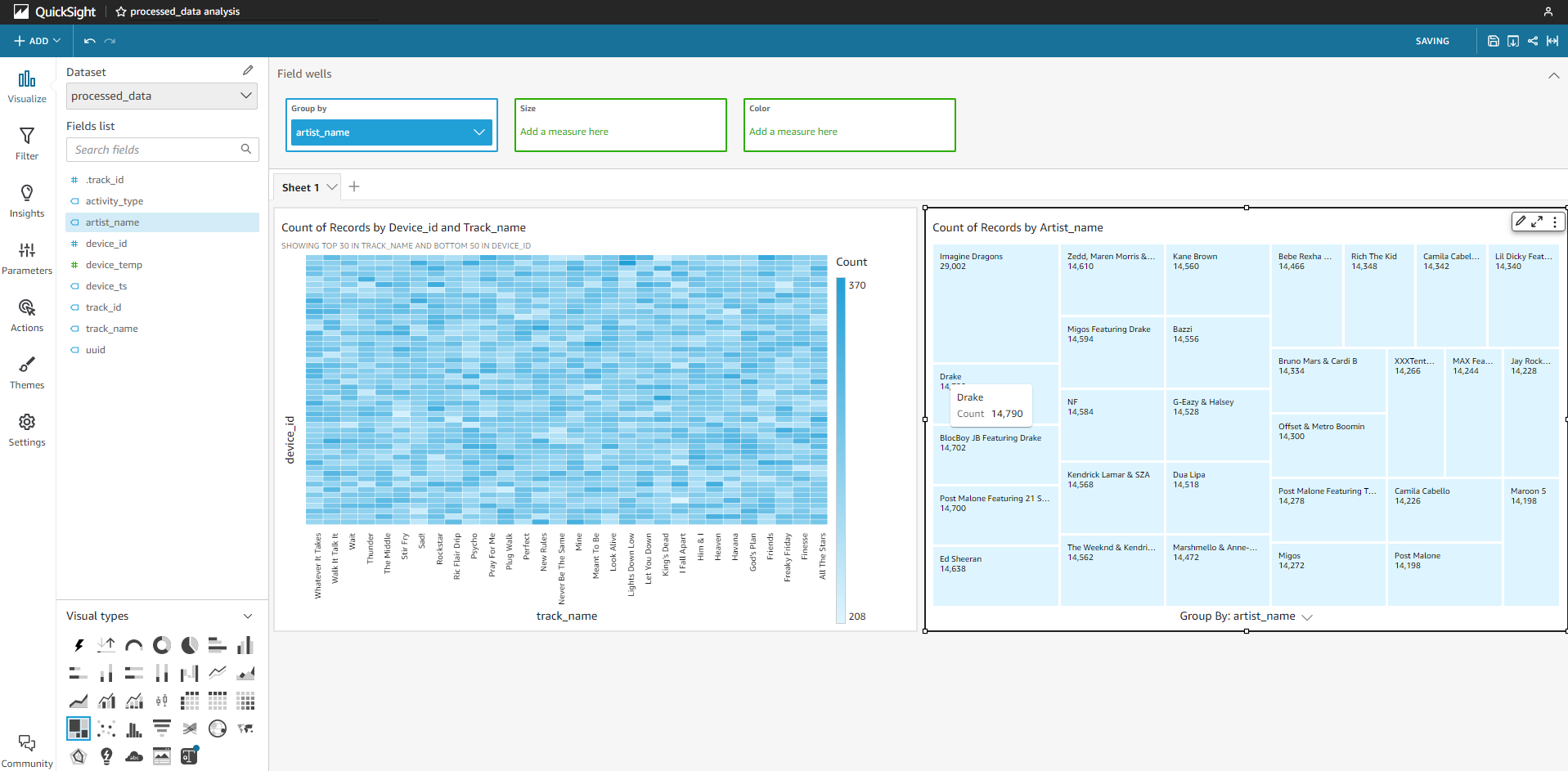
Illustration 2: Tree map of the most played artists
- In this step, we will create an illustration showing the most played artists.
- In the upper left corner, Select ‘+ Add’ > Add Visual. This will add a new panel to the right panel.
- In the lower left panel (Visual types):
- Hover over the icons to see the names of the illustrations
- Select on Tree Map
- In the upper left panel (Fields list):
- Select artist_name
- Experiment and explore the Amazon QuickSight Console. You can try filters, other types of illustrations, and more.
- So far, we have represented data using Kinesis firehose, stored data in S3, subscribed to tables in AWS Glue data catalog, transformed data using Glue ETL/EMR, and accessed query and visualize data using Athena and Quicksight. This provides an end-to-end architecture, from source to enterprise dashboard, in a serverless analytics deployment model.
- The two Next modules introduce Lambda and Redshift and include Next enhancements to this architecture, to meet the various additional requirements to deliver on-demand data for analytics.